A Tiling Desktop Environment
I've been thinking about graphical shells recently. One of the great things about open source desktops1 is there is a plethora of choice when it comes to graphical shells. However they seem to fall into two camps:
- Full featured desktop environments that stick to the conventional stacking window metaphor.
- Narrowly featured window manager based environments that include tools like tiling window managers often optimised for efficient keyboard use.
I am currently using the second of these through the Awesome window manager. I'm really enjoying the keyboard centric operation, and almost never needing to manually position newly spawned windows. Each workspace (desktop) gets its own layout2, which describes how windows are laid out. For example, my most commonly used layout has one master window that takes up half the screen then additional windows are stacked on the right half. The split between the two halves of the screen is easily adjusted with Super﹢h and Super﹢l. Layouts can be changed on the fly with Super﹢space to suit your work.
Another aspect I enjoy about Awesome is its snappiness. This is largely due to the lack of animation. Switching workspaces is instant, without any unnecessary flourishes. It seems that the animations used in many graphical shells these days tend to reduce the perceived performance of the system. Look how fast this iPhone is when animations are disabled.
The drawback to window manager based environments is that you give up the cohesive, full featured nature of a desktop environment. For example, these are features of GNOME that I had to research, install, and configure after moving to Awesome (items in italic are ones I haven't actually taken the time to implement yet):
- Compositor
- Volume and brightness status and control
- Network status and control
- SSH agent, GPG agent, polkit agent
- Screenshot tools
- Media controls
- Notifications
- HiDPI support
- Cursor sizing
- Automounting of external drives
- Automatic multi-monitor support
- Desktop gracefully adapting to monitors being added and removed
- Screen locking
- Power management
- Battery status
- Low power warnings
- Clipboard preservation
- I.e. clipboard source can exit and you can still paste
- Color management
Even with many of these implemented the components don't always work as nicely as in GNOME. For example, my XPS 15 has a built-in 4K display and I connect it to an external 4K display at work. When dunst shows a notification on the built-in display the text is sized wrong, when it shows on the external display it is correct, even though the displays are identical resolution.
On the flip side Awesome has these things in its favour:
- Lower resource usage (mostly RAM)
- Alternate window management layouts:
- Stacking
- Tiling
- Floating
- Maximised
- Full screen
- And more
- Keyboard oriented
- Keyboard bindings completely customisable
- Better use of screen space
- I have no title bars on windows
- Top bar is very short and can be instantly toggled with Super﹢b
So all this makes me wonder, where is the middle ground? Where is the desktop environment for professionals?
Pro Desktop
Mac OS is a popular choice for developers in some circles and has the cohesive full-featured experience that I mentioned above. I conducted an informal survey on Twitter to try to see what things Mac users are adding to the system to make it work better for them:
Hey Mac power users! I'm doing some research: What tools do you install to make the UI/graphical shell work better for you? Things that come to mind are: Alfred, Divvy, Spectacle, FastScripts, LaunchBar, chunkwm, that kind of thing.
The responses almost all included one or more of these elements:
- Window management (often via the keyboard)
- Keyboard remapping
- Automation
- Application launching
- System stats
Some open source desktops have all these features but the ones that have them all seem to lack the polish and consistency of Mac OS, GNOME, or KDE and require a large investment in researching, installing, and configuring each desired feature. The ones that have the polish and consistency lack the customisation and keyboard control.
So where does that leave me? I want a desktop environment like GNOME but with more control over window management and more keyboard control.
Update 7 Apr 2024: System76 is building a new desktop environment for Linux called COSMIC. It aims to replace their current GNOME based desktop and I think it is exactly what I am looking for: a complete desktop environment with tiling and keyboard control built-in.
Perhaps there is room for something that takes the place of gnome-shell in
the typical GNOME desktop but built for this use case. gnome-shell is
built on mutter and there are other desktop shells built on this too such as
gala, and Budgie, so perhaps it would be possible to use mutter as the base
window manager and compositor and build upon it.
I've been considering starting such a project but before diving in decided to write this post and do some more research to help clarify my thoughts. Something for me to ponder. 🤔
Comments
Why don't you just…
Inevitably some folks will be thinking, "why don't you just…". Below are a few of these that I've thought of already. I may add more as time goes on.
Use KDE
One possible option is using KDE with an alternate window manager. Although this does prevent you from using Wayland. I am fan of Wayland but not yet a user. I believe it is the future of the graphics stack on open source desktops and I think its architecture makes sense give the way computers are used today.
My problem with KDE is the aesthetic. KDE and Qt really don't seem to align with me. That's not to say they're bad or even ugly, it's just not to my liking. I suppose as an ex-Mac user I feel more at home with GNOME/GTK. On the other hand it seems like someone familiar with Windows would feel more at home with KDE/Qt.
Things like menus attached to windows, icons on buttons, icons on menu items, Application launcher menu ("Start" button), bottom task bar, and apply buttons in configuration dialogs all feel very foreign to my Mac using past. Sure some of these may be configurable but I'm not sure I'd ever feel at home.
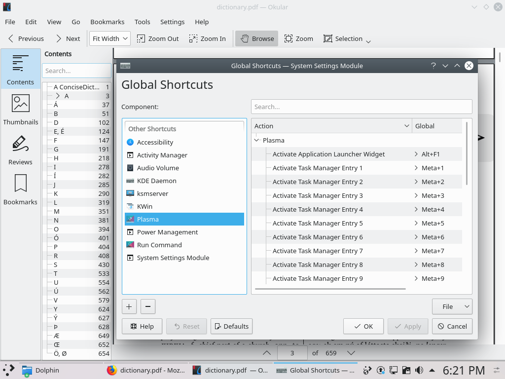
KDE neon: Icons on buttons, Apply button for configuration, task bar, Start-esque menu.
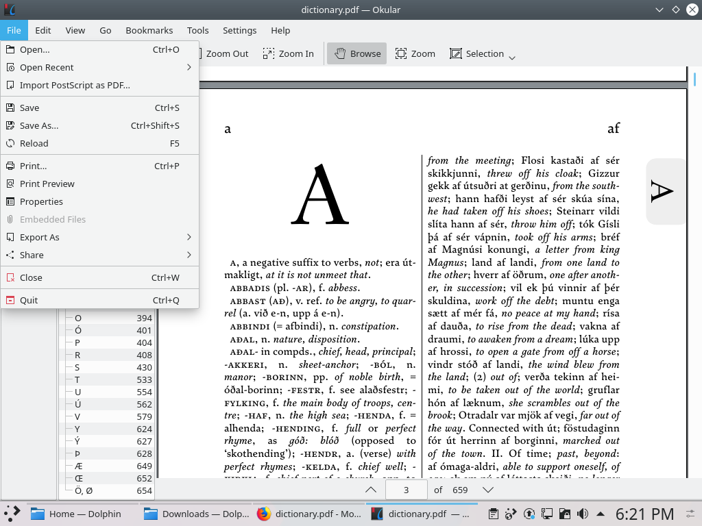
KDE neon: Icons in menus.
For comparison here is GNOME showing the the same things. I prefer that it is less busy and to be honest more like Mac OS in some ways.
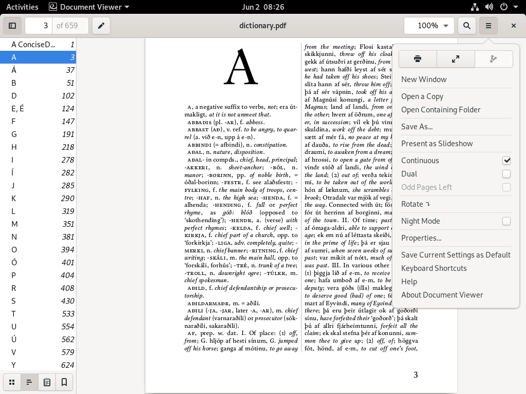
GNOME: No icons in menus, no task bar.
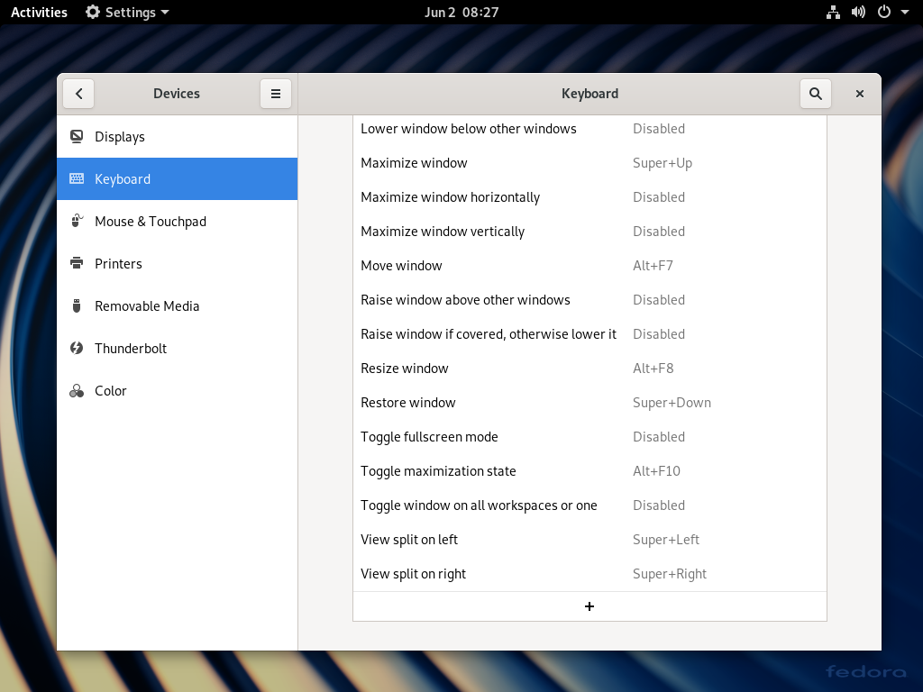
GNOME: No Apply button in settings.
Use Xfce
It is possible to use an alternate window manager with Xfce. However, while Xfce has made recent progress on HiDPI support it's still a mishmash of blurry icons, and tiny controls in places.
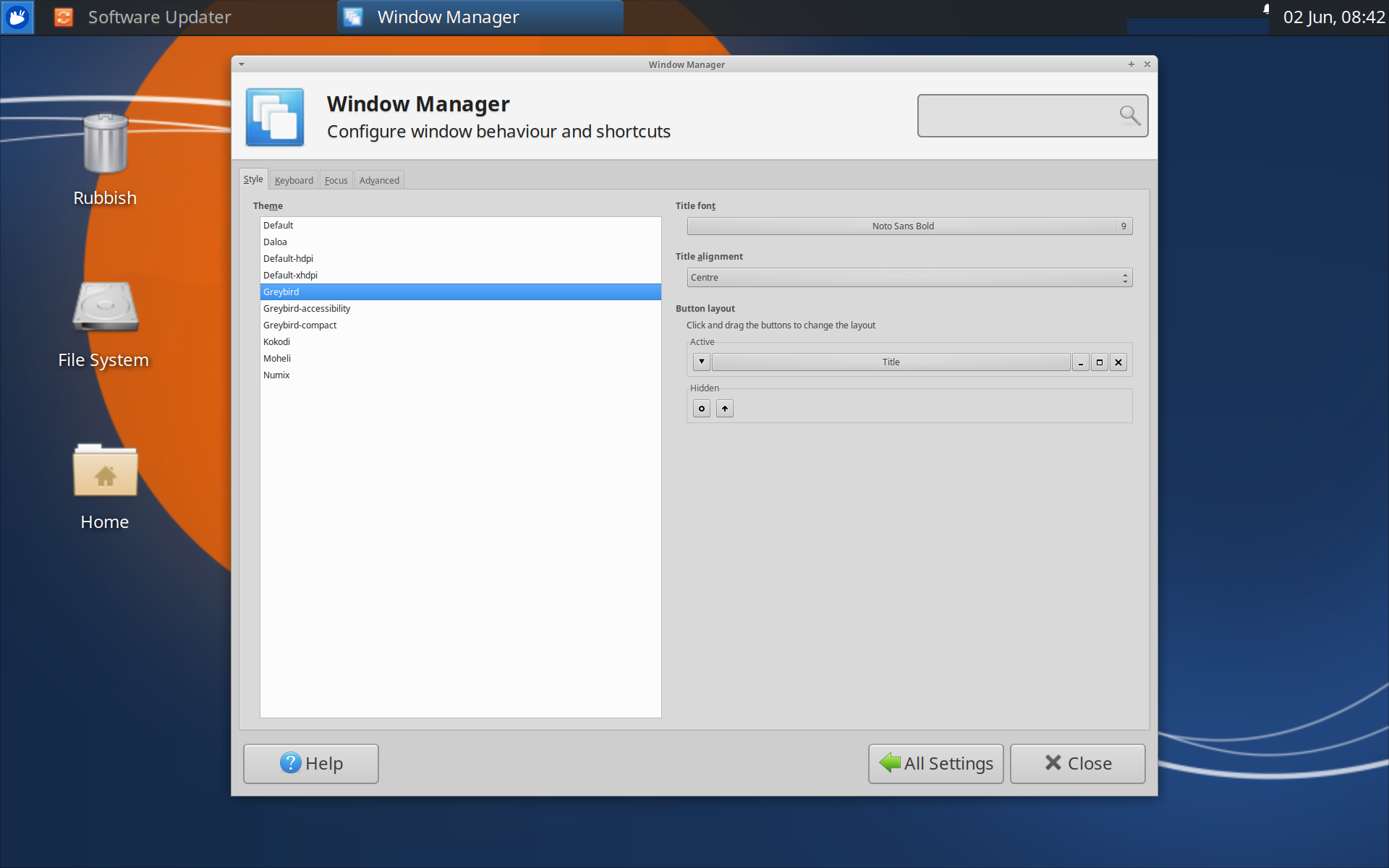
Xubuntu 19.10 with 2x scaling: Blurry icons, tiny controls.
Use the gTile GNOME extension
gTile is more of a manual window resizer. It allows you to position windows on a grid but it doesn't appear to have anything approaching Awesome's layouts.
Stick with Awesome
It's true that Awesome is working for me but it does feel a bit like I'm back in the dark ages needing to find and configure things that I've previously taken for granted. It is nice to build your own environment like this but the little imperfections like the dunst notifications mentioned above, or handling of external displays have me wanting more.
I'm referring to these as open source desktops and not Linux desktops since they work on other systems too, like BSDs, and OpenIndiana.
My first Awesome includes a litte information in the layouts.